
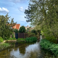
Hockney-esque pool shot, Viñales, Cuba, December 2016
“Sir, You state, … that cigarettes will be sold in “boxes decorated in an off-putting shade of olive green”. I don’t believe there are “off-putting“ colours … The colour will be quite beautiful in a couple of weeks.”
David Hockney, 2015, letter to Financial Times
Given Hockney’s support for the colour olive green, I thought I would “olivify” one of my recent shots from Cuba. I shared this iPhone image recently and received a few comments that suggested it was Hockneyesque – so I’ve added olive-coloured waste bins to this version!
If you’re a Hockney fan, the latest David Hockney exhibition is opening at Tate Britain in London tomorrow, 9 February, running until 29 May 2017.

Hex colour reference: #BAB86C
A colourful note: the yellowish-green shade known as olive green, appeared in crayon form in Crayola’s 1903 range. Named after unripe or green olives, it is a well known colour and a term that has been in the English language since late Middle English, probably 15th century.
![]()
Copyright Debbie Smyth, 8 February 2017
Part of Color Your World


Nothing to dislike here! A bit of R and R by that pool’d be lovely, Debs. 🙂 🙂
LikeLike
-ing
LikeLike
We used to call it ‘NATO olive’ for obvious reasons. Anyway, I prefer black olives.
LikeLike
A new one on me.
Sent from my iPhone
>
LikeLiked by 1 person
Well, you never lived in Germany and weren’t used to speak the lingo like a native. 😉
LikeLiked by 1 person
https://de.wikipedia.org/wiki/Oliv
LikeLiked by 1 person
Thanks for the link!
LikeLike
Have just been to Tate Modern today, to see Sir Elton John’s collection of photographs, by the likes of Edward Weston, Dorothea Lange etc, and am hoping to see the Hockney sometime….
LikeLike
I went to the Elton one s few weeks ago. What a collection. A bit of everything!
I hope to get to Hockney too. No idea when but at least we have a few months.
Sent from my iPhone
>
LikeLiked by 1 person
Excellent!
LikeLiked by 1 person
Not off-putting at all!
LikeLiked by 1 person
🙂
LikeLiked by 1 person