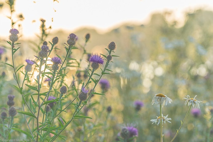
Hyde Park, London, summer 2015
 Hex colour reference: #926eae
A colourful note: this colour is named simply after the violet flower, but has also long been linked with royalty and majesty. Roman emperors were known for their purple togas, and during the Middle Ages the colour was worn by bishops and university professors and was often used in art to depict the robes of the Virgin Mary.
Strictly speaking, purple and violet are different colours, with violet having its own wavelength on the spectrum of visible light, whereas purple is a combination of blue and red. Interestingly, in Chinese art, the violet and purple shades are used to represent the harmony of the universe because of the combination of red and blue, or yin and yang.
In the Crayola world, the similarities between violet and purple have added a little confusion to this shade’s history. Violet has been a Crayola crayon since the company’s origin in 1903 but has suffered a little schizophrenia over the years. It has been the same shade as the Purple crayon for much of its life, but it seems that from 1949 the crayons bearing the violet name became a different shade and then reverted back to the original in 1957.
![]() Copyright Debbie Smyth, 18 April 2016
Copyright Debbie Smyth, 18 April 2016
Part of Outdoor Wednesday


Love this soft dreamy image… and violet is one of my favourite colours
Mollyxxx
LikeLike
Beautiful photo! Thank you for the info about violet and purple!
LikeLike
Such a pretty photo, and I always love your colorful notes! 🙂
LikeLike
Thank you kindly
On Mon, Apr 18, 2016 at 11:12 PM, Travel with Intent wrote:
>
LikeLike
Always learning , through this post !
LikeLiked by 1 person
Such a beautiful image. The main reason for this colour only used by royalty etc is that it was the most expensive colour to produce, thus only really available to the richest and royalty.
LikeLike
oh, thank you for the extra info – makes sense now
On Mon, Apr 18, 2016 at 9:22 PM, Travel with Intent wrote:
>
LikeLike
No, not a shrinking violet!
LikeLiked by 1 person
Lovely soft atmosphere – so appropriate for the colour
LikeLiked by 1 person