I like this a lot – the subtle tones really work too!
I have a feeling – whatever your editing choices are – it will work with this one 😃
Such an inviting place!
The power of nature taking over the old Hotel Forum, Krakow, May 2026 Welcome to One Word Sunday photo challenge, and over to all of you to join the challenge […]
One of the many gnomes out on the streets of Wroclaw, Poland, May 2026Baggage readyand travel cash in hand I’m off on my travels in a few days – do […]
Geometric shapes of socialist modernism in Manhattan (aka the Toilet Seat Buildings), Wroclaw, Poland, May 2026 Welcome to One Word Sunday photo challenge, and over to all of you to […]
Dressed in Blue, Zinneke Parade, Brussels, Belgium, May 2026 Welcome to One Word Sunday photo challenge, and over to all of you to join the challenge with your own blue image.To join […]
Lenin memorial in Regla, Havana, Cuba, November 2025 This work by Thelma Marin was installed on Lenin Hill (Colina Lenin) in Regla in 1984, the 60th anniversary of the man’s […]
Havana, Cuba, November 2025 Welcome to One Word Sunday photo challenge, and over to all of you to join the challenge with your own animal(s) image.To join the challenge, please use pingback […]
Faro del Castillo de los Tres Reyes del Morro seen from the Malecon, Havana, Cuba, November 2025 Now over to all of you. Do come and join us in our […]
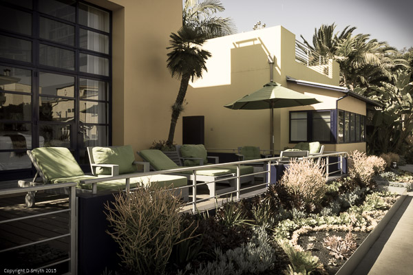


Missed this last week – this is like a favourite California hotel from the 50s…
LikeLike
I really love this photo. Thanks for sharing.
LikeLiked by 1 person
Thanks Michelle
On Tue, Mar 10, 2015 at 10:58 AM, Travel with Intent wrote:
>
LikeLiked by 1 person
Nice work Debbie
LikeLiked by 1 person
Lovely image and tones – why can’t they build houses like these in the UK?
LikeLike
That would be nice. Though I suspect these were probably specific commissions, many others were older and more traditional.
On Mon, Mar 9, 2015 at 2:44 PM, Travel with Intent wrote:
>
LikeLike
I quite like the muted tones, they give the picture a really nice style.
LikeLiked by 1 person
The muted tones look like what is trendy in house magazines that I have seen lying around – very modern looking 🙂
LikeLiked by 1 person
Hi Debbie, I must have missed your week 1 image! This edit has a classy designer look with its muted tones. Nice work!
LikeLiked by 1 person
I’m going to find it hard to make another edit I like as much as this one
On Mon, Mar 9, 2015 at 4:44 AM, Travel with Intent wrote:
>
LikeLike
wow- this looks so lovely with the muted tones
LikeLiked by 1 person
I like this a lot – the subtle tones really work too!
I have a feeling – whatever your editing choices are – it will work with this one 😃
Such an inviting place!
LikeLike
I think you’re right – I’m planning a fun one for the fourth week 🙂
On Mon, Mar 9, 2015 at 12:51 AM, Travel with Intent wrote:
>
LikeLiked by 1 person
Cool! Look forward to them all 😃
LikeLiked by 1 person
That lounge area looks just so choice!
LikeLike
I wouldn’t mind living there myself
On Mon, Mar 9, 2015 at 12:28 AM, Travel with Intent wrote:
>
LikeLiked by 1 person